Benjamin Menist


Hare:
After reading the third Earthsea book, I wanted to visualise the crazed wizard, Hare, who had fallen into addiction. The image below was the result, which I still quite like, especially how stylistic it looks. However, more recently I wanted to redraw it in a more realistic style, this time focussing on just his head. Unlike most of my other illustrations, this one doesn't have linework so as to aid the realism of it, instead using many shades and highlights of varying hues to give a more 3D effect. Although I am extremely proud of this, I can see parts of his face that are out of proportion, and the beard looks very 2D compared to everything else. I could also add more detail to the clothes, though I wanted them to seem a bit out of focus.


Selzarr:
Selzarr is an original character I designed, inspired by the insect world of Hollow Knight. After making a fairly simple illustration of him on the right, I made some revisions to his design and decided to redraw him in the style of the Silksong album cover. This was one of the first projects where I learned to shift my hues when shading to give a more realistic effect, along with giving metallic objects slight reflections of their environment. I also made use of the then new text tool in Fresco, but had to add the intricate border and slight glow manually, duplicating and flipping the layer too for lack of a symmetry tool. Although I could probably improve on the depth or detail of this piece, I'm still very proud of it and have used it as my profile picture for nearly a year now.


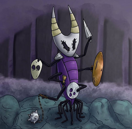
Peedle & Paro:
These pieces are quite close to my heart as they are actually redrawings of characters my younger brother designed based on the game Hollow Knight. On the left is Peedle, a strong-spirited vessel with a ring lasso. On the right is Paro, a many-limbed warrior with an assortment of equipment and weapons. They both also have their own areas that Dan designed, which I tried to allude to in their respective backgrounds. I really like how these two show the improvement I've made with my digital shading and colouring over just a few months.

.jpeg)

Spidersona:
If you're not familiar with the movie Spiderman: Into The Spiderverse and the spidersona trend that followed, I would highly recommend checking it out. This is a personal project I worked on designing and illustrating my own persona as Spiderman, in an alternate version of Croydon. This was one of my first times using alcohol markers to try and create blended shading between strong hues, so there are definitely things I could improve, but overall I love the design and the composition of the piece, along with the slight blur effect to highlight the moving tram.


Elemental Pieces:
This project started as a small art challenge with a four-colour pen, inspired by the YouTuber Jazza. I wanted to create five distinct elemental characters with unique styles and personalities and spent time planning out each of them before I began drawing. Once I had a solid sketch though, I decided to scan it to the iPad so that I could do a full colour version later. I realy enjoyed shading with the different colours on paper, and think parts of the original look better than the digital version, like the water. However, the tools available on the painting app I used did allow me to add much more colour and depth to the piece, with interesing details and effects.Recently, I actually did a redraw of this old piece as I really liked the concept but wanted to improve on the shading and anatomy. This time, I spent much more time planning out the proportions, colours and poses of each character, as well as how to visualise their elemental powers. Below you can see some pictures of the development, from sketches to colours and shading with backgrounds. Even though this project took many weeks, I'm extremely pleased with the result and am glad I took the time to carefully plan and detail each aspect, try out different approaches for the fire and water effects to best fit my style, and even add some backgrounds to hint at further depth to the characters.


Monet Interpretation:
If slideshow below doesn't load, click HERE to open in new tab
App Design:
If slideshow below doesn't load, click HERE to open in new tab
If slideshow below doesn't load, click HERE to open in new tab
Protest Design:
If slideshow below doesn't load, click HERE to open in new tab
Rebranding:
If slideshow below doesn't load, click HERE to open in new tab
Lightsaber Advert:
If slideshow below doesn't load, click HERE to open in new tab
If slideshow below doesn't load, click HERE to open in new tab
If slideshow below doesn't load, click HERE to open in new tab
iPhone:
For the iPhone model, I closely followed a tutorial by CGI Tutorials in Maya to model not just the front of the iPhone but the protruding cameras on the back and the charging ports. For the screen, I imported an image of a graphic design piece I had made, which is described in the slideshow below. Unfortunately, I did lose all the 3D files for the project so all I have left are the renders.


If slideshow below doesn't load, click HERE to open in new tab